- Treatment

One of our team memebers suggested that we should solely focus on making it a slapstick comedy, so we watched a few examples on you tube like Buster Keaton, the goodies and mr bean to see if we could get some ideas and see which direction we could take our pre - production planning.


Our group thought it would be best to keep the ideas very simplistic but effective so it would engage the audience very well and make them laugh, at certain oddball situations that a person can find themselves in. we were going for a vintage black and white look from Buster Keaton with the action slightly speeded up to portray a big hurry. Mr Bean also worked exceptionally well for us, because the comedy is very basic but still very dynamic and contemporary. we also thought that any one in the audience can relate to what he is doing. whether it is in a church, a field or at a fairground.
- The story
Our story at first didnt have any distinct character plots, it was rather a group of friends getting together to play a new board game without knowing the consequences. we tried not to completly copy off jumanji, but to include a conflict over the transporting dice with hilarious results. we diversed that we could have the characters be transported back in time to a certain period or era where we could use probs and costumes.
But we thought this would possibly take too much time to arrange and set up since the brief stated we had to keep it simple, and we werent permitted to use post production techniques such as editing and music.
I suggested it would be best to follow along the lines of a paradigm worksheet, which i learned about during the screenplay module. this meant following along the 3 act structure but not as technically as using the plot points. it made the story much more easier to figure out what happens as it progresses along e.g
- ACT 1 - the set up
this stage involves character development, stating how each character is and what is going to happen to make the characters react the way they do to lead onto the second act.
- ACT 2 - the confronation
is where the conflict happens where the main characters have many tests and obstacles laid out in front of them which seem impossible to overcome.
- ACT 3 - the resoulution
everything is figured out and the results become clear, sometimes the characters have changed mentally or physically for the worst or the best.
this structure helped a group to discover which element and character were more important, and which ones were going to change as the story progressed onwards.
- The Story Boards
ACT 1 - the set up

ACT 2 - the confronation

ACT 3 - the resolution

1 - A group of friends decide to play a new board game which involves moving pieces around the board. there is an eerie look about the dice but they think its all part of the game.
2 - everyone is confused on who should go first, so they choose the youngest should
3 - He or she shakes up the dice and rolls
4 - all of a sudden they disappear into thin air
5 - They re - appear in the middle of a train track, in the middle of nowhere
6 - the others stand around baffled, wondering to themselves what to do
7 - They come up with a plan to rescue their friend, so they hold hands and one of them throws the dice.
8 - They all disappear into thin air aswell, but not knowing where they are goin got end up
9 - The dice lands on a snake eyes ( which is the only way to get back)
10 - they all re - appear in the middle of a hillside located just outside the city
11 - They decide to go their seperate ways to search for their friend, with hilarious confrontations
12 - The first person who disappeared is wondering around the countryside ( related to a Mr Bean situation)
13 - Meanwhile another friend strolls past the empty table with the game hardly played. he notices the dice with a weird shine to them.
14 - he picks up the dice and rolls them, which turns out to be a snake eyes
15 - Allt he characters re - appear looking somewhat different . One with a Mexican hat on, one dressed in costume, another with a different hairstyle and the last with something he hung onto from his surroundings
16 - they decide to play again, since the first time was so much fun
Our story doesnt have to follow the story boards precisely, it was just a blueprint to use and relate back to just incase we didnt have any other ideas to go with. these boards were to help determine the characters and what they could all do within the story. which moves onto the script which is much more detailed in character personalitiess and confrontations.
- The Script
I believe a script was quite difficult to think of, since we wernt allowed to use any dialogue or sound. so it mainly had to be a full description of what was happening during each act and scene. I tried my best to include every team member into the story. Writing the script helped me decide on choice of location and choice of slapstick situations, but I soley focused on moments drafted from the Mr Bean series.
CHANCE ENCOUNTER
Scene 1 - ACT 1
INT: LIVING ROOM - DAY
A group of friends walk through their front door of their shared house coming from university. They all plop down onto the sofa exhausted, contemplating about what they could do tonight. MICHAEL pulls a new board game from underneath the coffee table, which he got for Christmas last year.
Suggesting they should play it since they are too tired to do anything else. Everybody agrees, so the girls go into the kitchen for snacks while the boys set up the table, game board, and read the instructions.
The girls come back with crisps, chocolates and drinks and join the guys around the table. Everybody takes a look at the dice and sense something eerie about them but they don’t know exactly what.
Each person picks the piece they want to be and place them on the coloured squares, but the instructions don’t say who should go first, so they decide since SHEILA is the youngest she should.
SHEILA looks down at the board, picks up the dice, shakes them and throws them down onto the board
CLOSE ON DICE
Number 6, SHEILA goes to move her piece when she suddenly disappears into thin air.
INT TRAIN TRACK - DAY
SHEILA re appears in the middle of a train track somewhere in the city. She observes her surroundings, screams at the top of her lungs, and runs off the tracks hysterical.
INT - LIVING ROOM
One and all get up from their seats speechless and baffled, observing the dice and wondering what to do. SARAH decides that they should go and try to rescue their friend, wherever she is. So maybe if they roll the dice they would disappear to the same location as well.
So they all hold hands, MICHAEL picks up the dice and rolls it throwing a 2, a snake eyes.
Scene 2 - ACT 2
They all disappear into thin air as well, hoping to end up where SHEILA is.
INT - COUNTRY SIDE - DAY
Everybody re - appears in the middle of a country side wilderness just outside of the city. Dotted with blue and yellow flowers, with some shrubbery and a few trees providing shade just above them. SARAH starts calling out for SHEILA whilst the others look around to try and figure out exactly where they are. CHARLIE thinks it would be best if they split up, so they could cover more ground. So one person heads towards the city, whilst the others head out into the fields.
CHARLIE begins to walk past some trees and remembers he’s got some celebration chocolates in his pocket, he takes out a miniature milky way and starts to unwrap it when a bee comes swooping down and lands on it. CHARLIE trys his best to brush it off but all it does is keep coming back. Sooner or later he is running around frantically duelling with the bee to get it away from his chocolate. The bee ends up in his trousers, in his mouth, and in his ear when finally CHARLIE is lying on the floor amongst the flowers with the bee perched on his nose.
SARAH is wondering around the outskirts of the city calling out to SHEILA with no success when she gradually sees a fairground on the horizon.
INT FAIRGROUND - DAY
SARAH eventually arrives at the entrance and starts to look around some game stalls and then goes into the house of mirrors but still with no luck of finding her friend. As she is coming out of the fair an amusing looking clown runs up to her and hands her a goldfish in a small transparent plastic bag. She appreciates the gesture and keeps it leaving the fairground. As she is entering the city she discovers the bag with the fish in it has a hole in it, panic strikes and she runs around looking for a replacement. With no triumph she gives in and pours the little bit of water, with the fish into her mouth. Walking around the city with puffed out cheeks.
INT COUNTRYSIDE - DAY
MICHELLE is still wondering around the country hopelessly, being followed by a lonely group of sheep. Which she try’s to lose with no avail, so she takes no notice and carry’s on walking, looking out into the distance.
Scene 3 - ACT 3
INT LIVING ROOM - DUSK
STU walks through the front door after finishing work, to notice the board game half played, but with no one around the table. He goes into his room and dumps his bag on his bed, and starts to search around the house for everybody. He calls out to see if they’re in the bathroom or they’re bedrooms but he gets not answer.
He comes back to the board game, sits down and picks up the dice studying them closely, then looks at the game. It seems only one of the pieces has been moved but none of the others. STU thinks to himself that everybody probably got bored of playing the game and decided to go to the pub. So he chucks the dice down on the table and goes to leave the room. Whilst he does this, the dice land on a 2 which is snake eyes.
Out of the blue everybody appear in front of the television as STU falls on his ass, knocked for six. He looks up to see everybody have somewhat changed in appearance.
SARAH has a Mexican hat on, along with a poncho and sandals on her feet rather than trainers while MICHELLE has a baby Goat cradled in her arms.
SHEILA is still wearing her normal clothes but her hair is standing on end like she has been fried by electricity, as MICHAEL is completely naked holding a branch over his private parts and CHARLIE is dressed like a detective from the 1950’s.
They all look at each other and burst out with laughter but more with a sigh of relief that they’re all safe and sound.
STU looking them over with a huge smile on his face is quite intrigued by what has just occurred, so MICHAEL makes his mind up to roll the dice and play the game again. The others all shrug their shoulders and agree to experience a new adventure.
END
- Locations
Location | Time | Risk level |
TRAIN TRACK | DAY | VERY HIGH |
FIELD/ HILLSIDE | DAY | LOW |
LIVING ROOM | DAY/ EVENING | VERY LOW |
FAIRGROUND/ CARNIVAL | DAY | MEDIUM |
CITY | DAY | MEDIUM / HIGH |
A FARM | DAY | MEDIUM |

Some of the locations here can be used for the story, but only for the set up. the particular location above could be used for a potential starting point, where a character can end up. this would be a very good alternative location for the train track idea.


All these locations were very reasonable, because whilst shooting on loactaion one has to consider having the permission to shoot. Places like a field or a park are considered public locations so anything can be done there. but other places like a train track or a carnival, the chances of shooting there are very slim to nil.
- Final Production
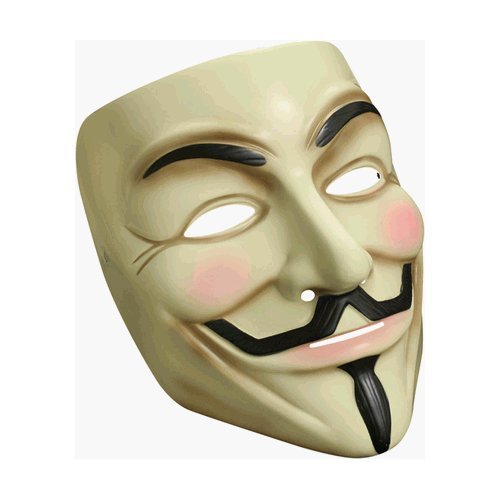
After carefil consideration the group decided against using, the above fram as a concept because we did not have the props or time constarint to complete fillming. So we decided on making our film about "A Mask of Seduction" using the V for vendetta mask as a prop.
because of time and shooting constraints the group decided to stay on campus, and try to find different ways in which the character wearing the mask could be pursued in a comic, slapstick way.
- What were the positives?
each role for the team members were allocated very well -
Kane Wright - Main character
Sarah Kimbery - Seduced girl 1
Nicole - Seduced girl 2
Adriann - Assistant director
Clayton Brooks - Camera operator
I believe the group worked rather well together on location. every member contributed to the ideas, and different ways we could film, revolving around the main character.
Shooting on location was very successful, the group enhanced locations like the student union restaurant, hallways, and surroundings to our advantage
Used the available light sources very well
Innovated within the group, developing ideas as we went along
Got the message across to the audience substantially well with the little time we had to plan the story, portraying humour and random acts. The audience not only found our shoot funny, but right from the start with the help of abstract camera shots, we were able to emphasise the importance of the mask and the power of the mask.
- What were the negatives
I think the only negative was primarily myself. after a time, i am still adjusting to working within a team whereas before i had to do everything myself and around the time after shooting i was coping with alot of additional pressure, wanting to take some time off.
So when it came to arrange a time to put a feedback presentation together, I did not attend. I could improve on this by arranging and attending every group session professionally also being punctual and reliable. using the experience and fun gained by shooting with the group to focus on the positives more when it came to analysing our work together.
I think this is the only thing that let the group and myself down.
Project Research
Story boards
Script
Locations


